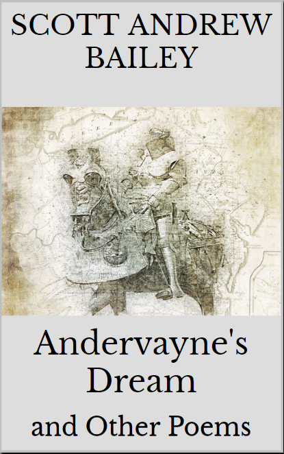
So, trying to design the cover for my upcoming poetry collection. So here’s a quick poll – which of these looks best? Are any of them any good? Or should I try again? Let me know in the comments.
A

B
C

So, trying to design the cover for my upcoming poetry collection. So here’s a quick poll – which of these looks best? Are any of them any good? Or should I try again? Let me know in the comments.

I think I’m going with B–though I like the darker gray on A, but not the black. I’m totally crazy for the knight image 🙂
LikeLiked by 1 person
C is definitely the best!
LikeLiked by 1 person
I am a little worried the text is not so clear on that one.
LikeLike